Home Textiles
|
|
How I work with color
Quilting is a slow craft, with many steps in the process. The sewing is actually the easy part.
For me, it's the choice of colors that takes the most thought and effort.
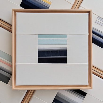
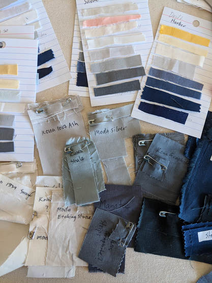
Like a painter, I compose my palette of colors before I begin, gathering fabrics and grouping them together to see how they get affect one another in various combinations. I shuffle swatches around until a group feels cohesive and balanced. Then I record the color names on a card, and attach a strip of the fabric for reference.
For Drift, I chose color schemes that evoke a quiet, calming, atmosphere.
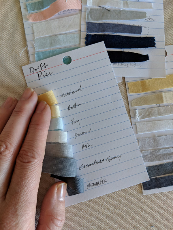
My colorway names refer to a group of colors, with watery associations, like Pond, Shore, and Atlantic.
I may make multiple Shore items (a pillow, a quilt, and wall piece).
Each will contain roughly the same colors, but no two will be exactly alike.
If you were to order multiples of one item, expect some variation, as each piece I make is individually crafted.
I always use a warm off-white for my lightest tone. It's much softer than stark white, and it doesn't compete with the other colors.
Sample palettes
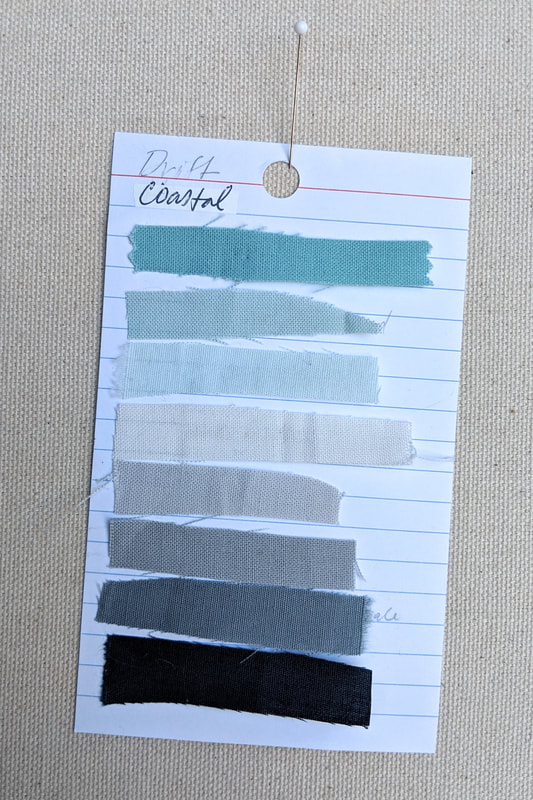
Coastal: navy, gray, aqua.
|
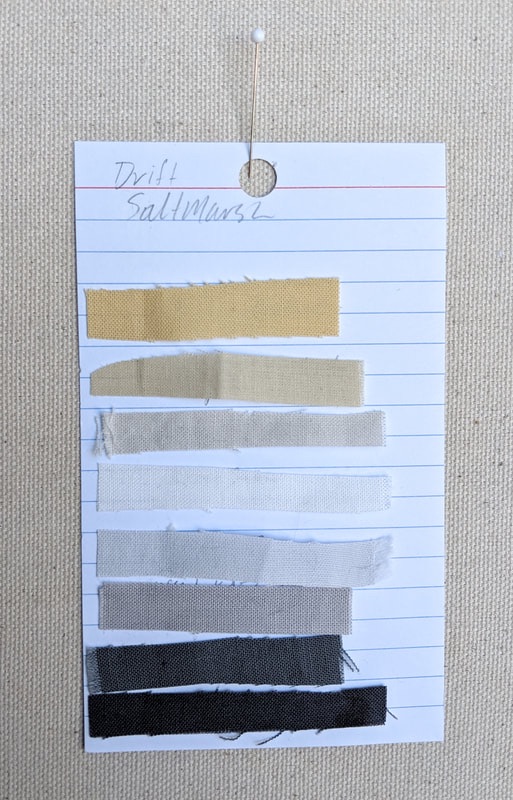
Salt Marsh: charcoal, warm gray,
gold.
|
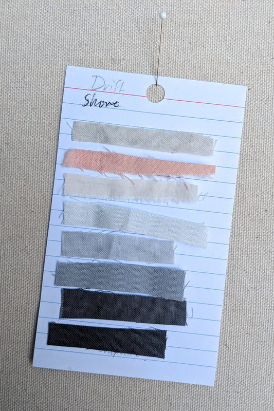
Shore: charcoal, gray, pale peach.
|
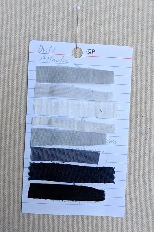
Atlantic: navy, cool blues, pale grays.
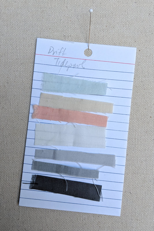
Tidepool: grays, peach, pale sky blue.
|
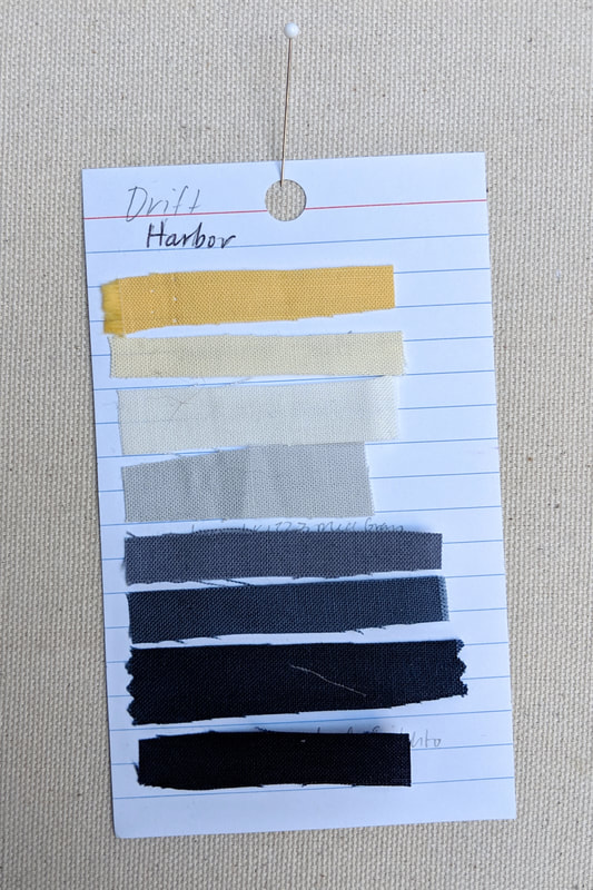
Harbor: navy, pale gray, gold.
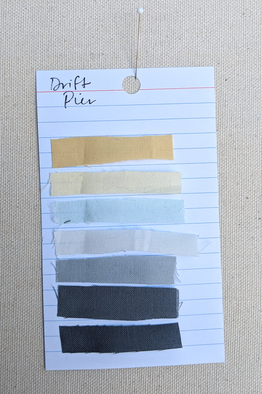
Pier: dark gray, gold, sky blue.
|
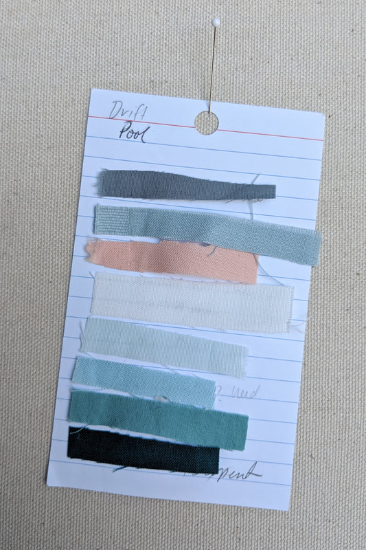
Pool: turquoise, aqua, peach.
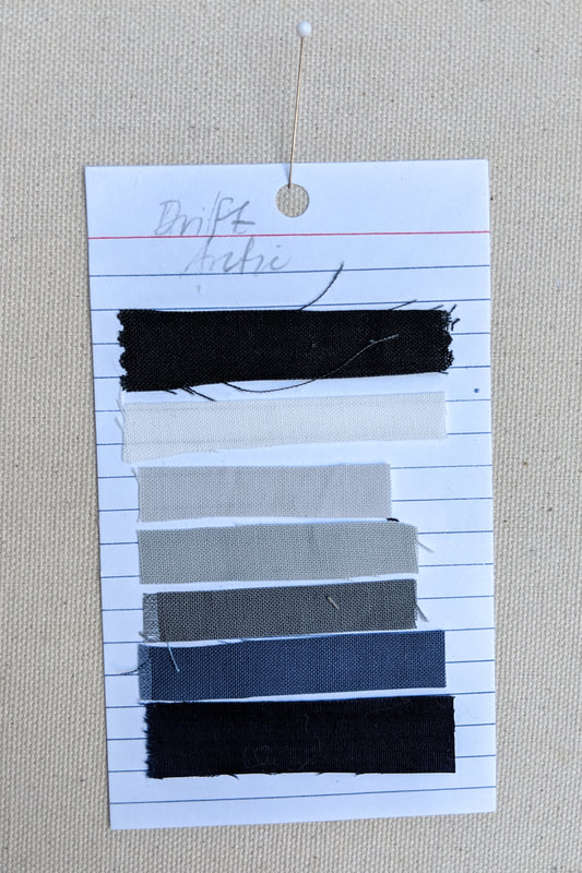
Arctic: dark blues, grays,
black.
|